Type
- Product
- System
- Brand strategy
Role
- Principal visual designer
- Visual design
- 3D Modeling
- Prototyping
Timeframe
- 6 Months
- Nov 2017 – May 2018
Company
- Frog Design
Allvest
A complete brand foundation, visual system, and progressive web application created for Allvest, a digital investment start-up by Allianz. The project encompassed brand strategy, custom logotype design, interactive product simulation, and end-to-end UX/UI.

00 · Summary
Challenge
Our challenge was to build a clearer, more intuitive marketing page and a seamless end-to-end product experience that empowered users to understand and confidently invest with Allvest, the new digital investment start-up from Allianz.
Outcome
Together with Allvest, we developed the brand foundation, a new logotype and its brand guidelines, a new narrative and layout for the marketing website, and a secure progressive web app designed to build user trust from the first touchpoint to the final investment decision.
Impact
1st
Deutschlands Beste Finanzdienstleister— by Frankfurter Allgemeine Zeitung.
Focus
Zum vierten Mal in Folge die Bestnote für Digitalen Service.
Credits
Ricardo Osório Santos
Creative direction, visual and 3D design
Lisa Williams
UX design
Jörg Radehaus
Project management
Brendon Donovan
Senior Lead engineer
Pier Paolo
Lead engineer
Tommaso Laterza
Frontend engineer
Diva-e Team
Backend for front end
01 · Approach
Parallel workstreams
We kicked off with fast-paced collaborative workshops to define the Allvest brand foundation. Two parallel workstreams then ran in tandem: brand identity and expression, and product design and user experience. In an agile process with the frontend team, we finalized the visual language and designed the product UI, delivering a cohesive and polished brand and digital experience.
Value proposition
A flexible, cost-efficient investment solution that combines investment funds and Allianz assets to deliver strong returns with a minimum guaranteed floor.
02 · Process
Brand identity
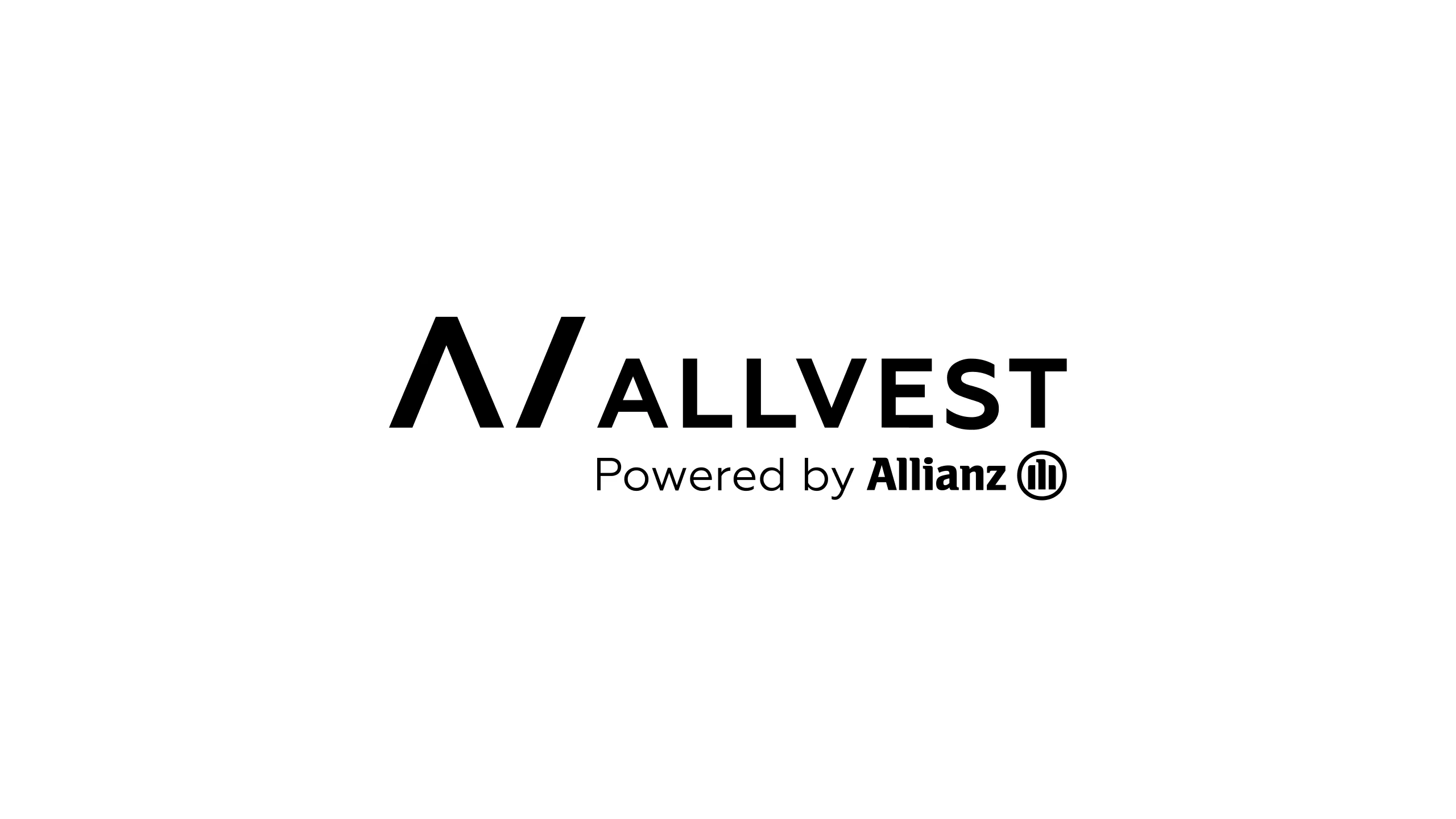
With the brand foundation established, I set out to create a new identity and visual language for Allvest. Our target audience was defined as digitally literate, design-aware individuals in their mid-thirties.


Brand grid and color
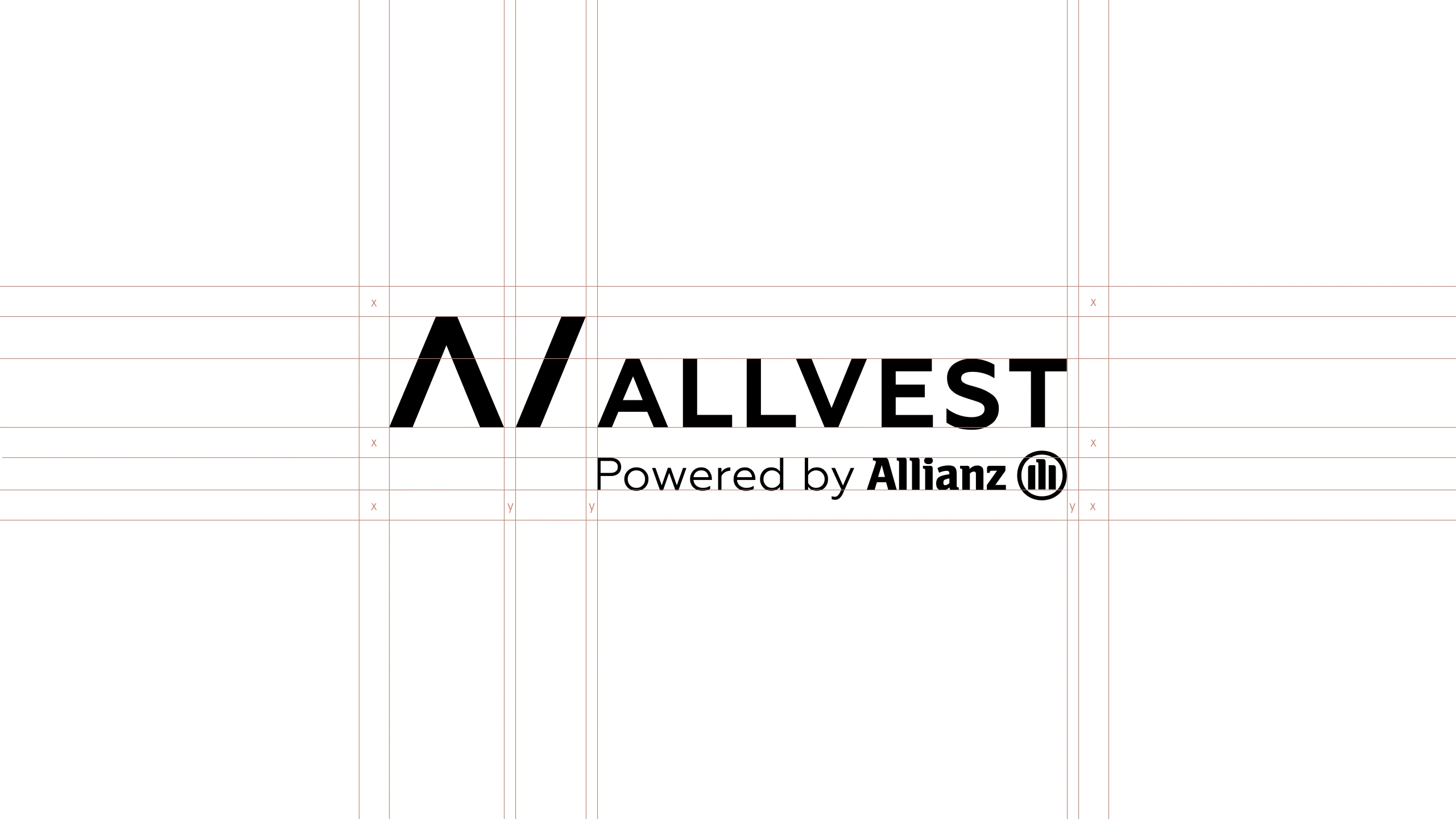
The Allvest grid is based on the angles of the letters A and V, which form the foundation of the mark. The primary accent, golden yellow, is complemented by Allianz blue to reinforce a sense of reliability and trust.

03 · Development
The marketing website
I explored nearly nine different visual directions in total. Aligning the three stakeholders proved to be a challenging task.
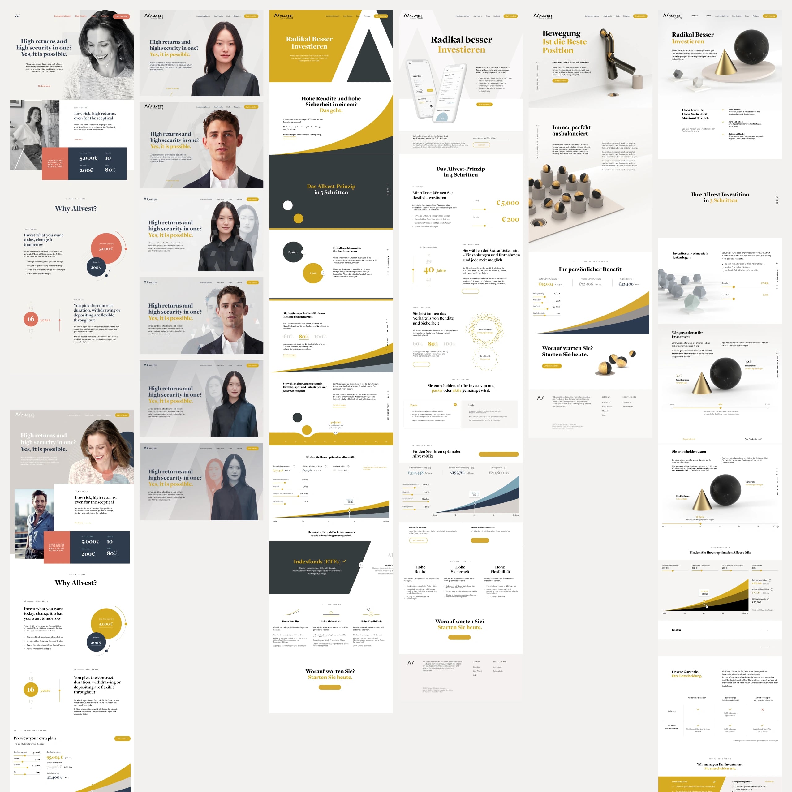
Visual metaphors
We needed a compelling way to make abstract financial structures tangible and easy to understand for everyday investors.
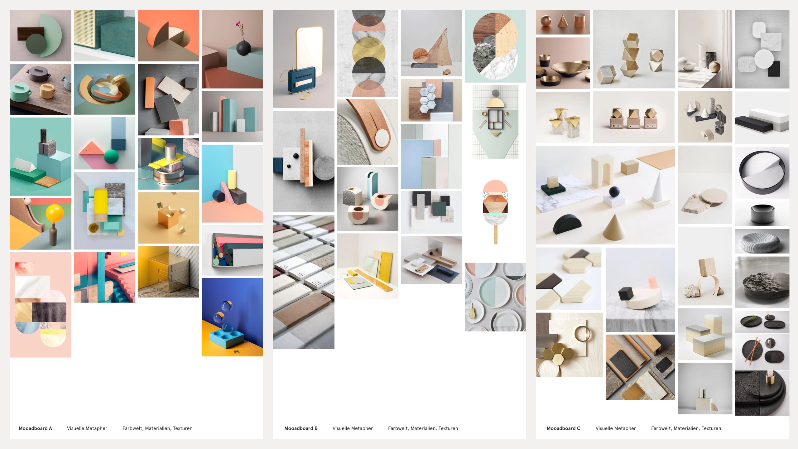
Moodboards and visual research
I explored ways to visualize how the product allocates investment volumes across two distinct strategies, and how this could be aligned with the brand positioning defined during the brand foundation process.
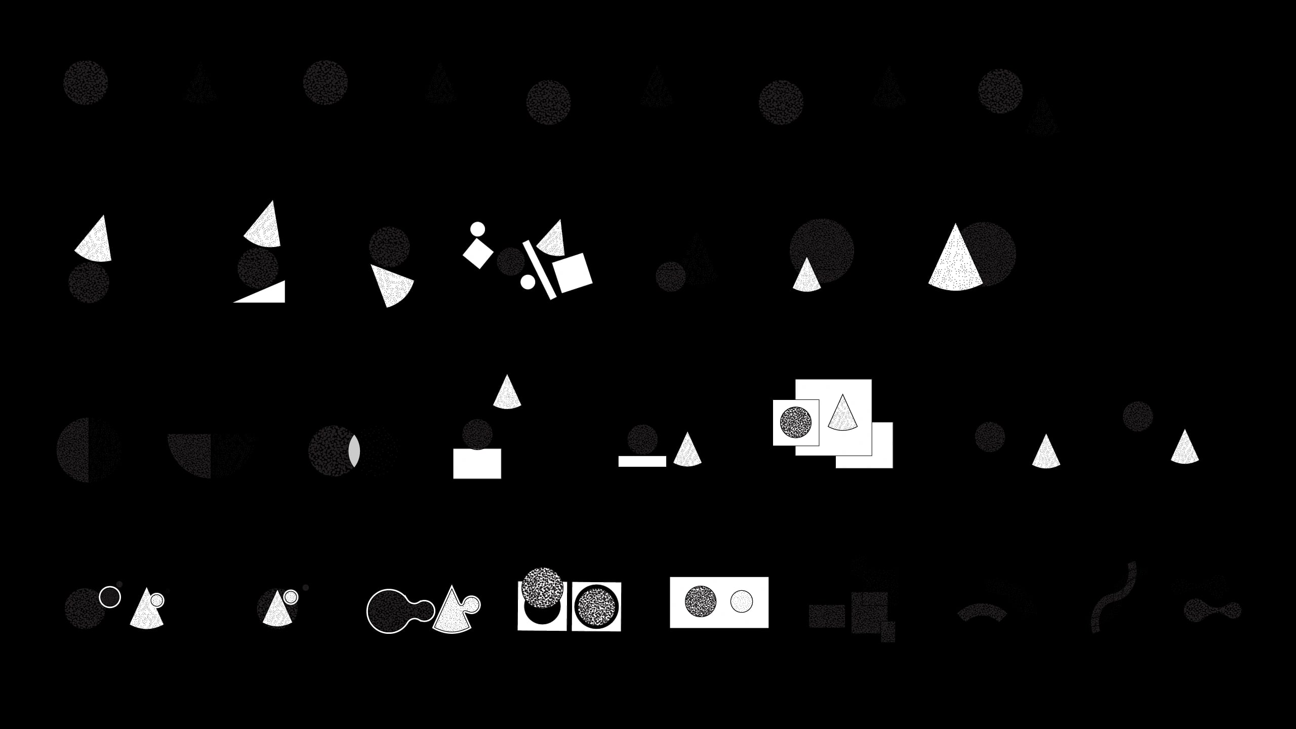
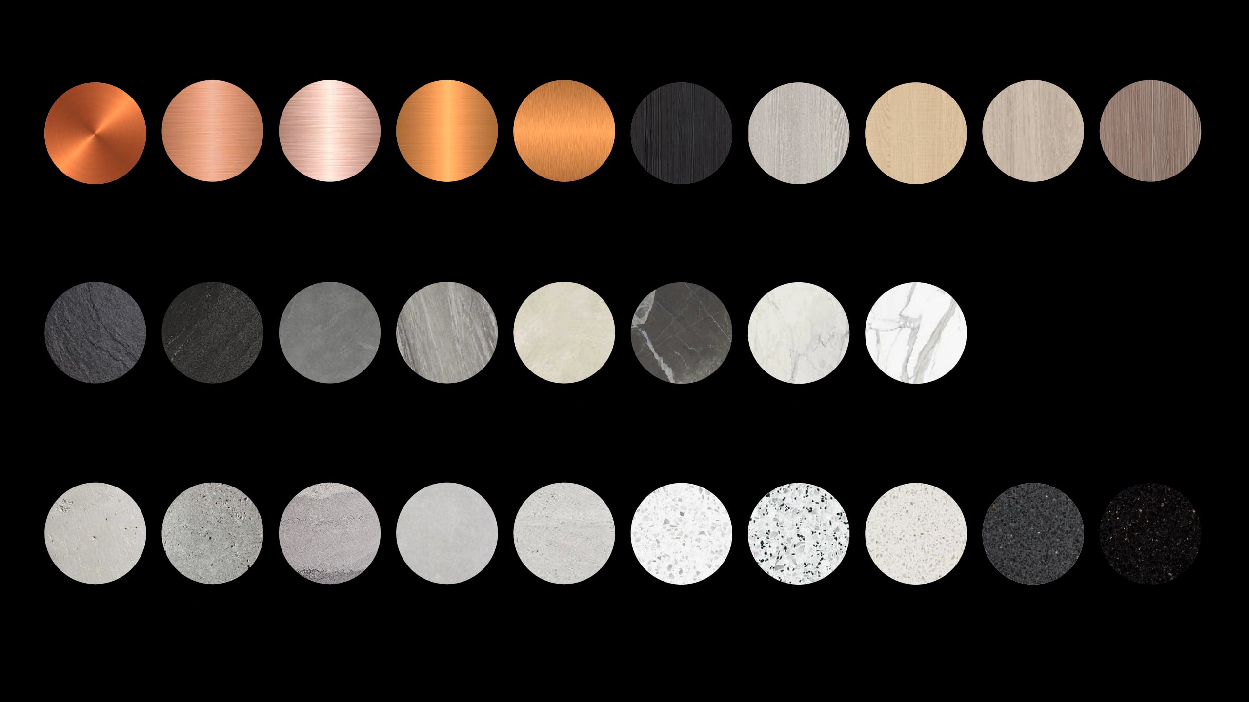

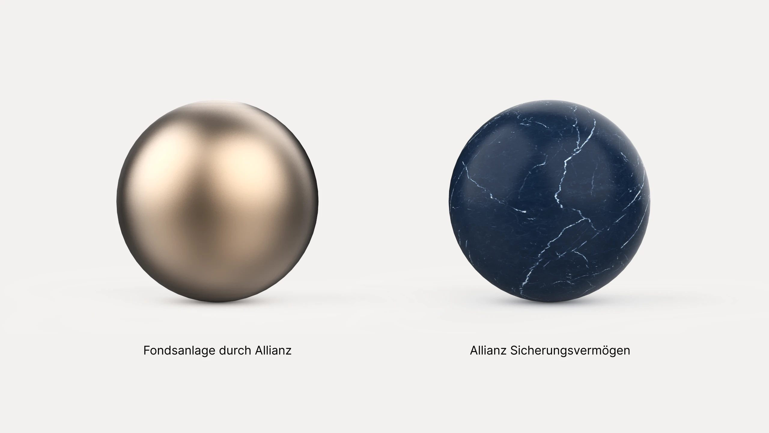
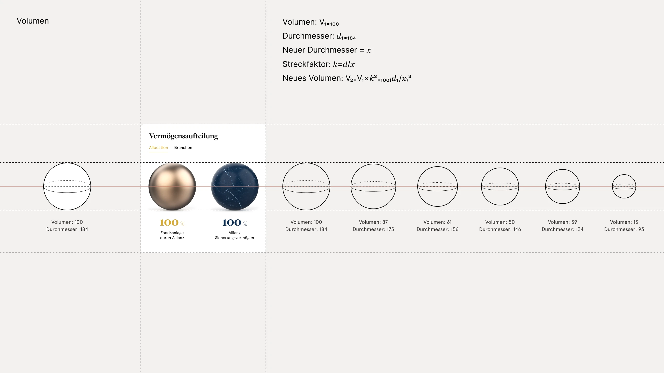
Precision in proportion
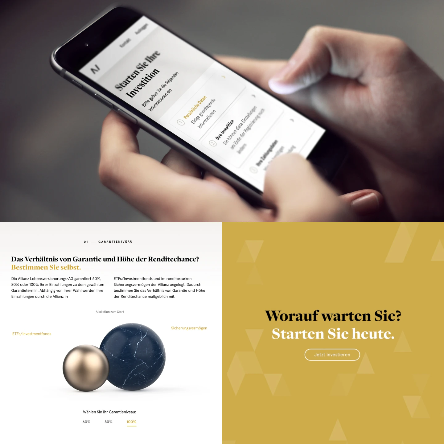
With mathematical accuracy as a non-negotiable constraint, the proportional relationship between two spheres was chosen as the primary visual metaphor for Allvest.
04 · Outcome
Bringing it all togeher
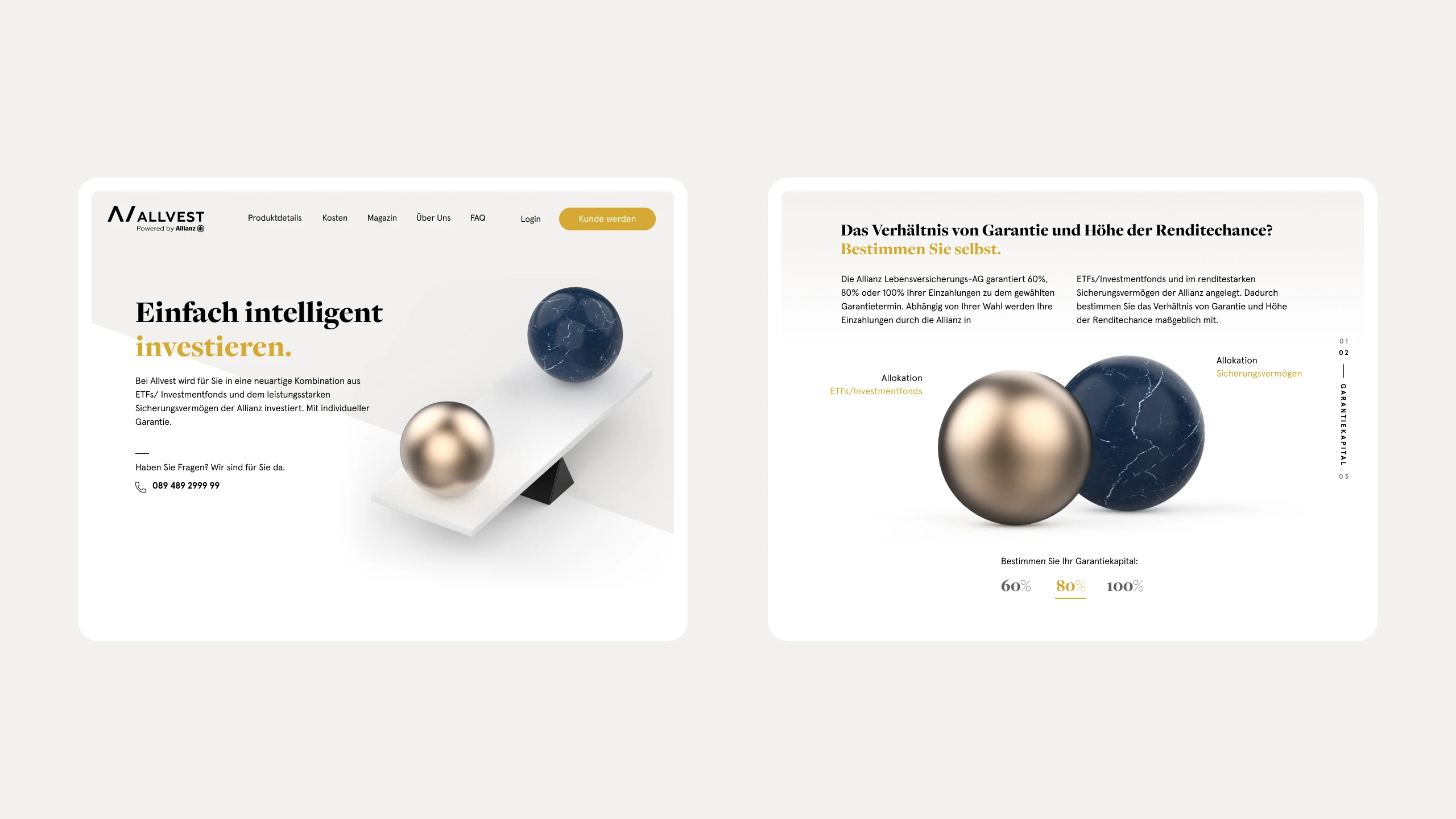
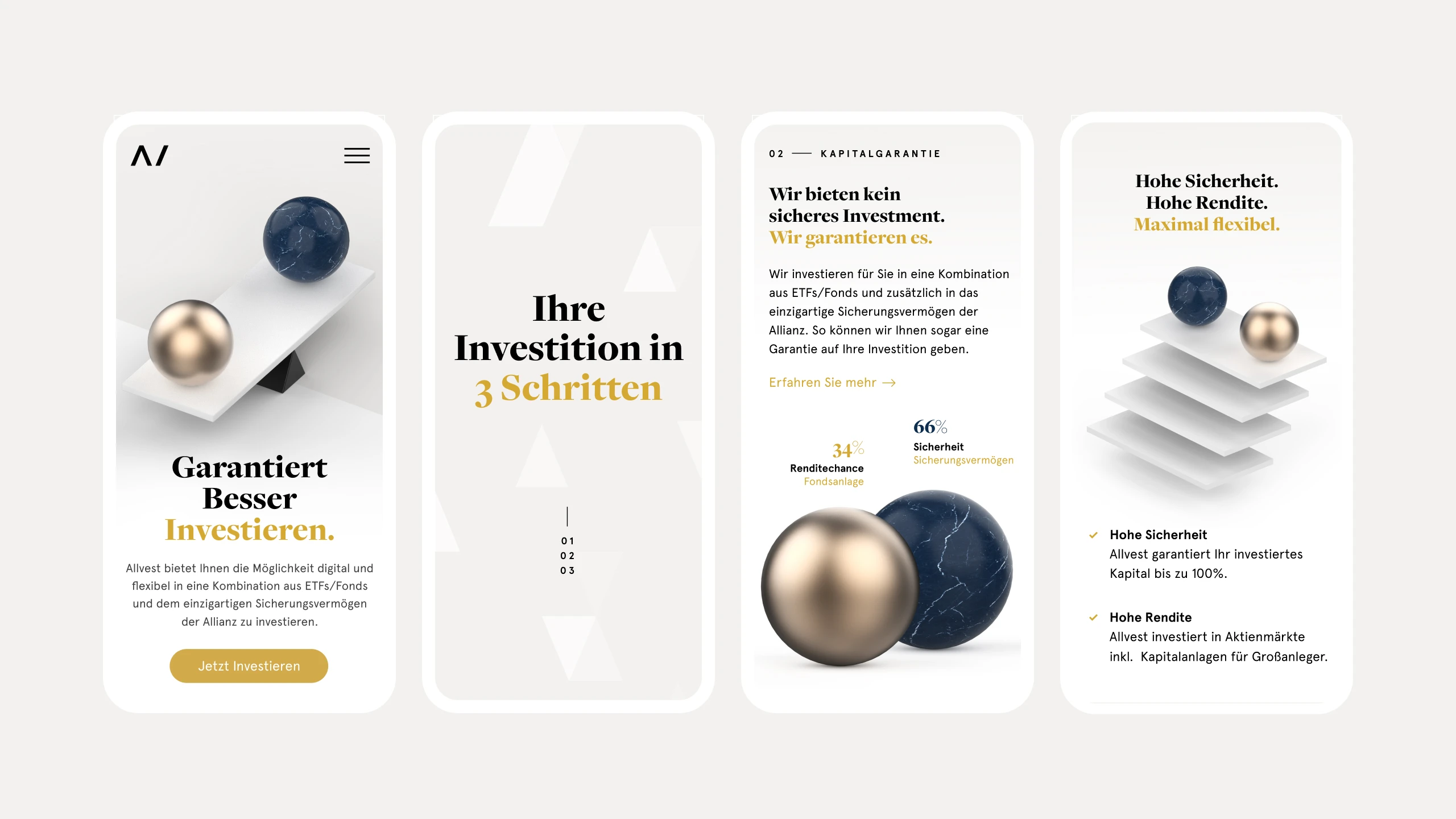
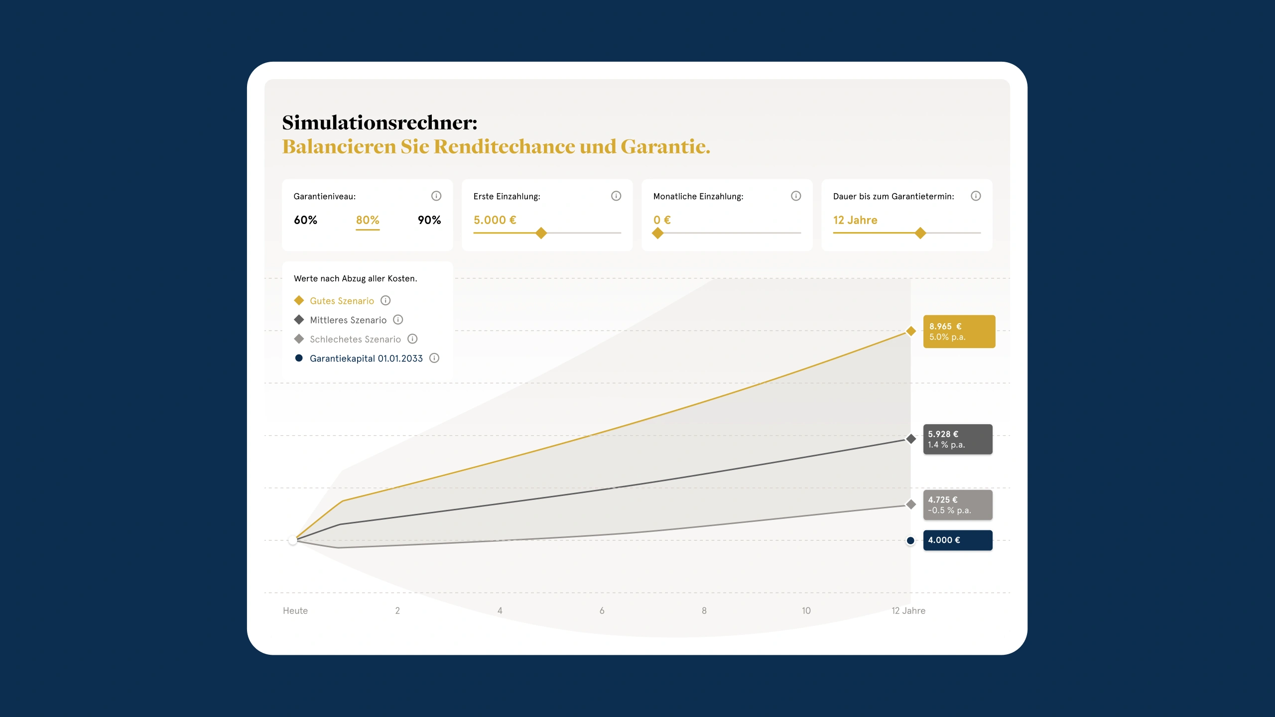
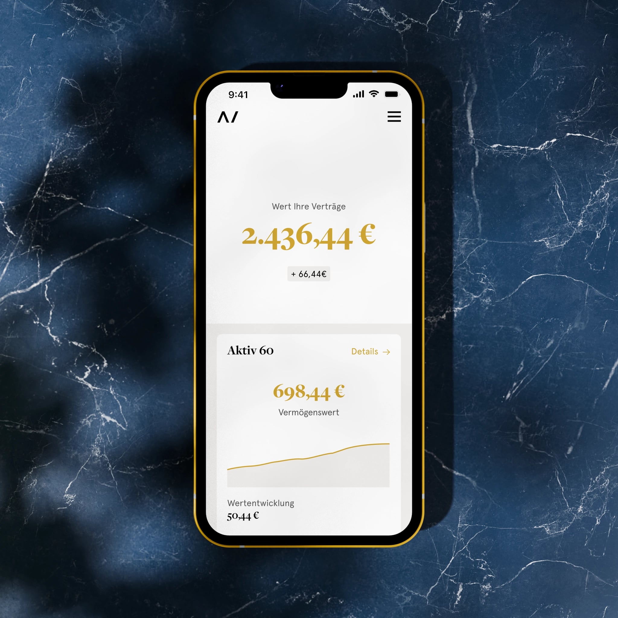
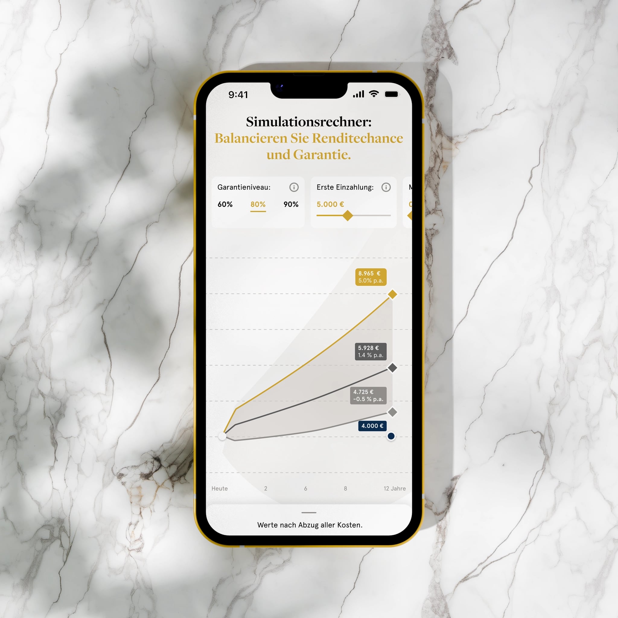
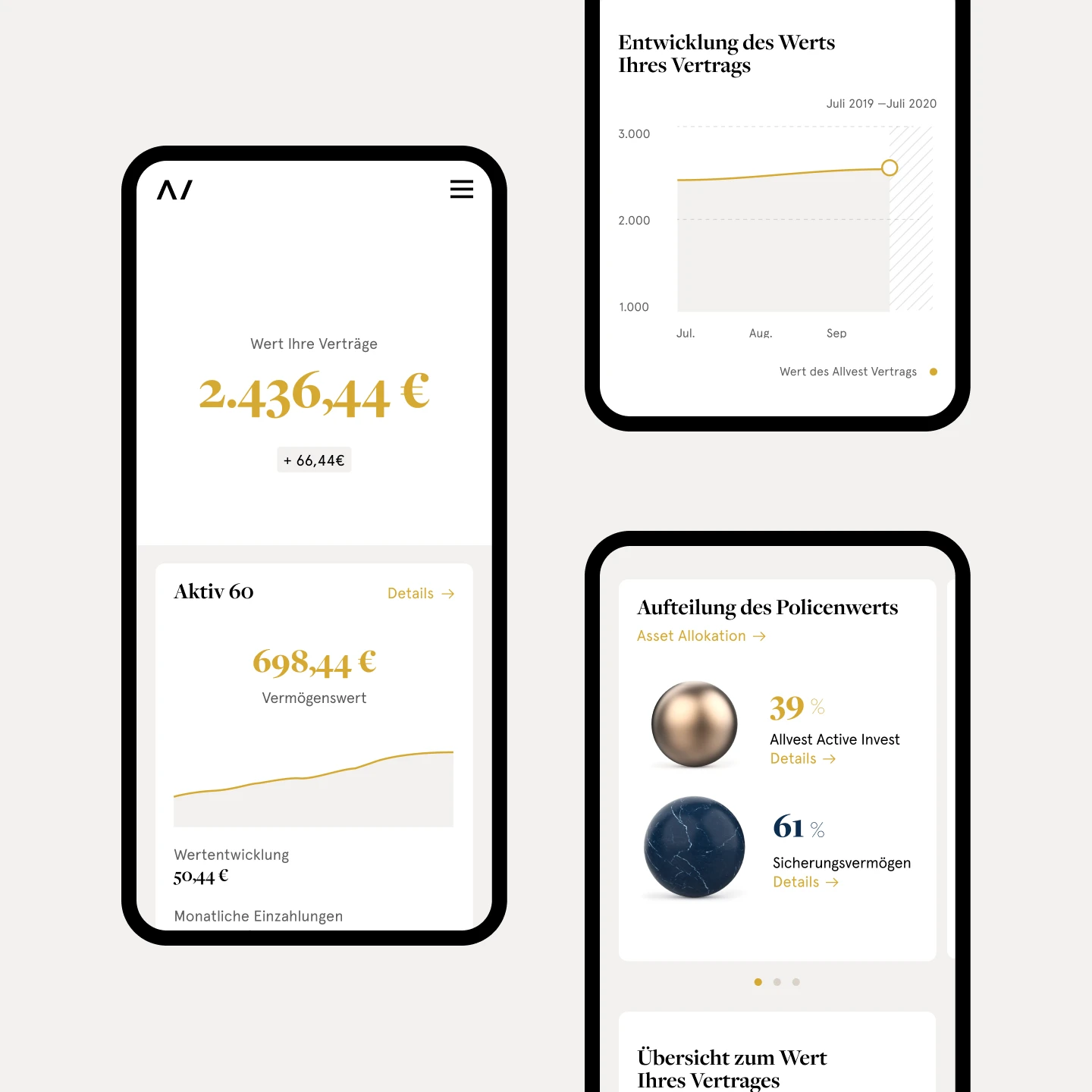
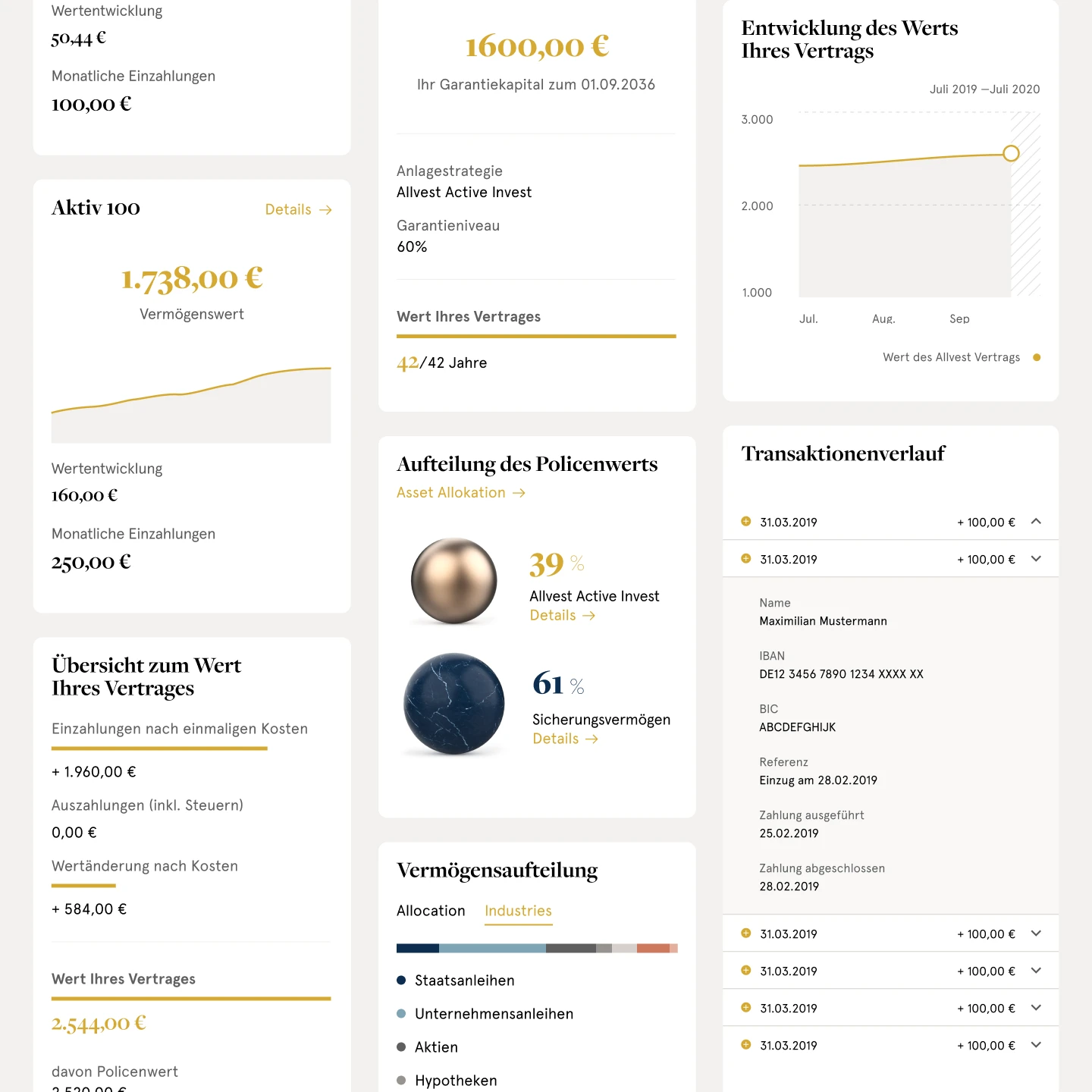
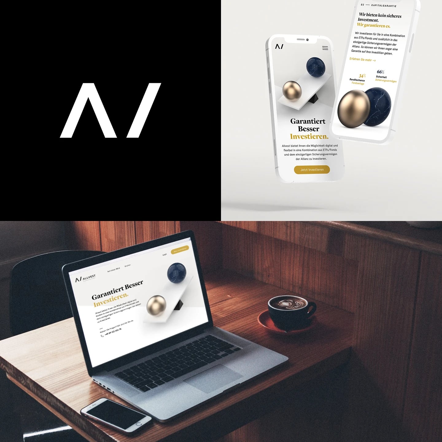
With the visual language matured and the product UX finalized, both workstreams merged, and the final UI was applied to the product, creating a safe, trustworthy, and transparent experience.
05 · Client feedback
What we've achieved together as a team during these last 6 months sets up a solid foundation for our future success.