Type
- Editorial
Role
- Creative writing
- Photography
- Cartography
- Web development
Timeframe
- 8 Months
- Jan – Aug 2014
Company
- Frog Design
Schnorcheln
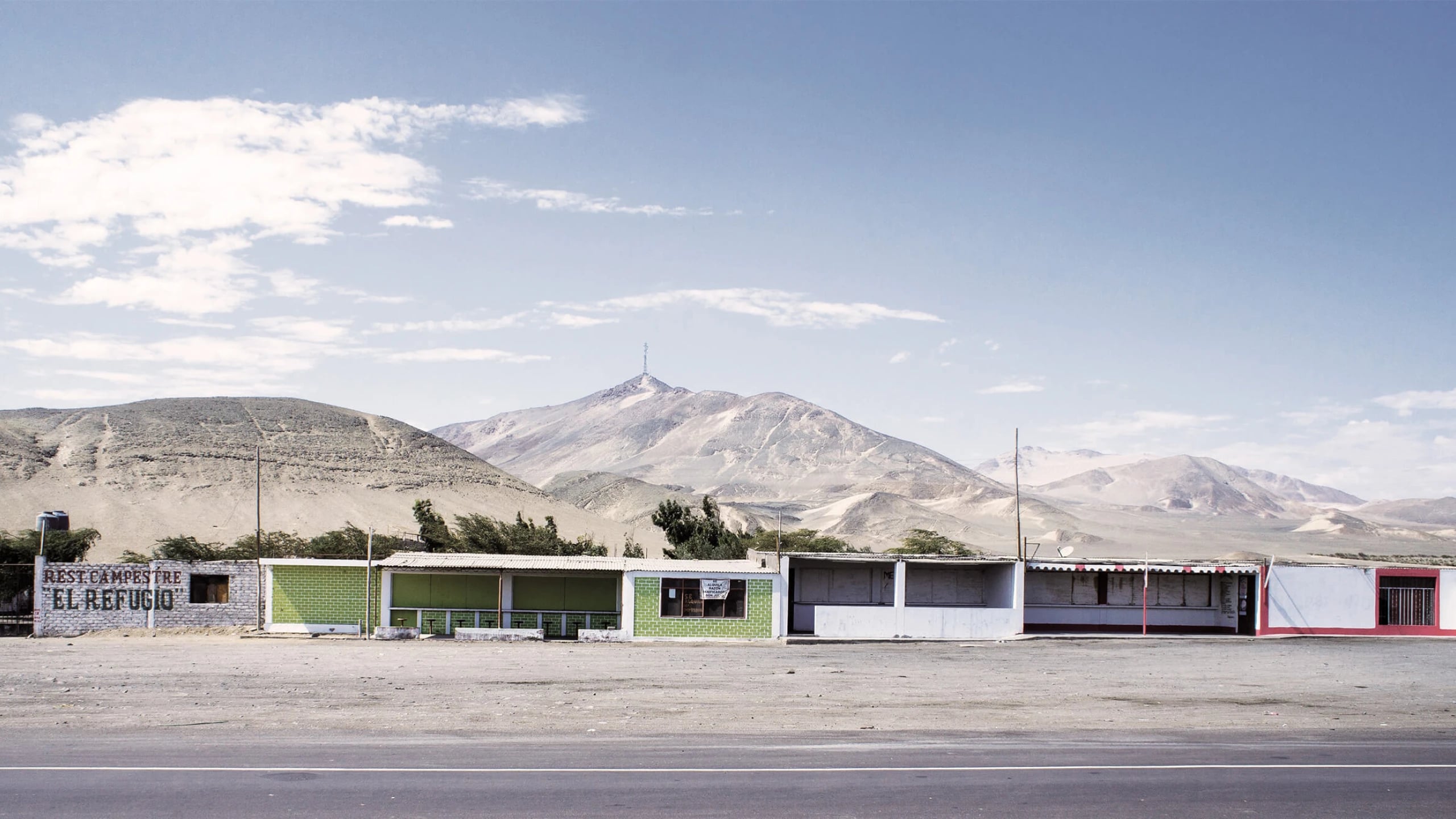
A travel journal written from the perspective of two graphic designers. Together, they spent ten weeks in 2013 traveling by local buses through five South American countries. The book highlights their individual experiences and provides historical insights into each place they visited.
00 · Summary
Co-writing a book
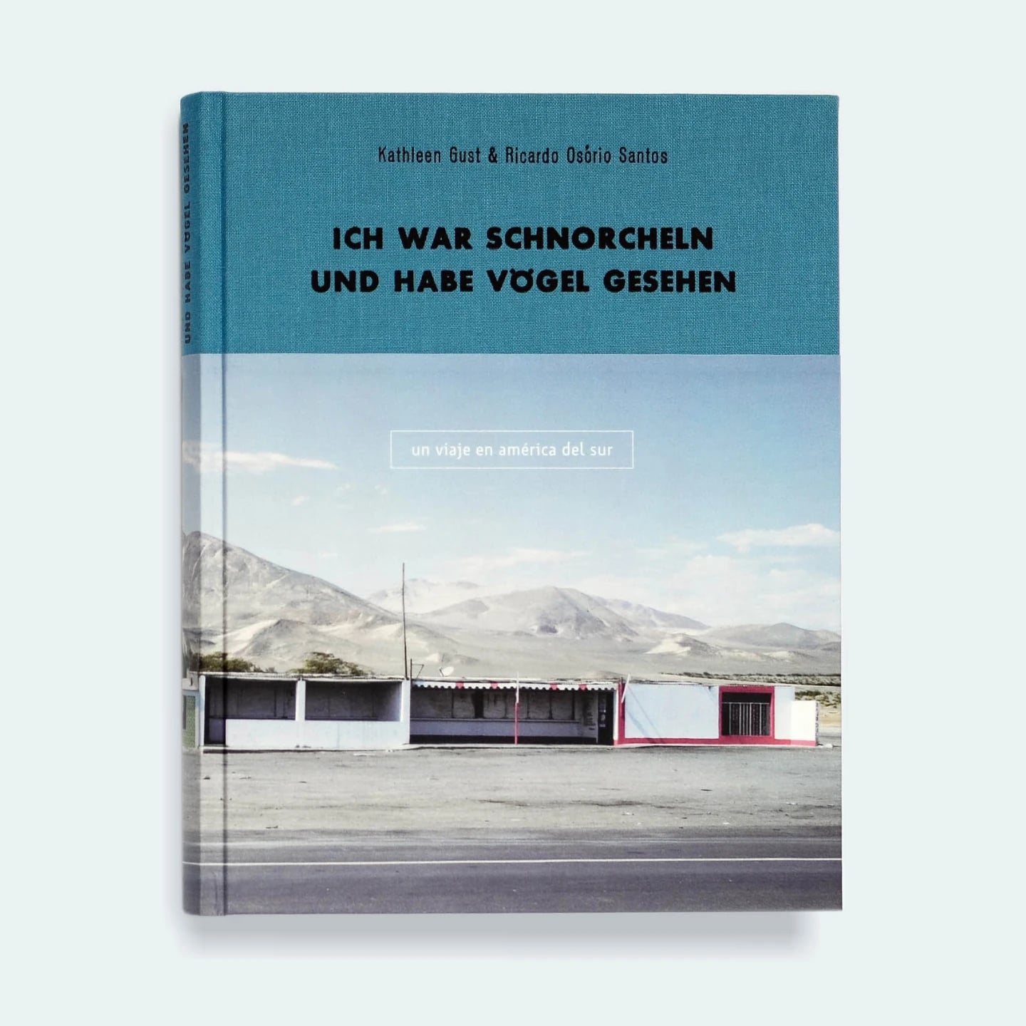
What do you do with so many impressions from a 10-week trip across one of the world’s most vibrant continents? Well, you write a 236-page book and pack it with the best entries from your travel journal. Of course, all those photos you took need a place to shine, too. So you complement the book with illustrated maps and infographics, pay a fortune to have it printed and bound, and then do your best to find a publisher — which might never happen.
Outcome
A total of five copies were printed in Berlin. We tried promoting it on social channels and presenting it to a few publishing houses at the Frankfurt International Book Fair, but, alas, the book remained unpublished.
01 · Approach
Two different perspectives
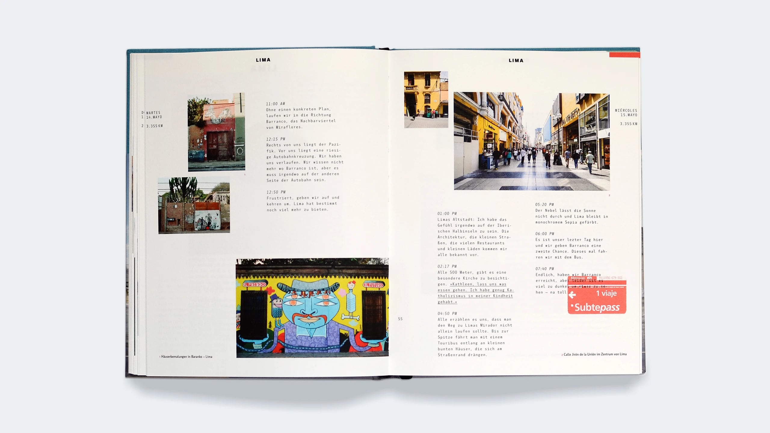
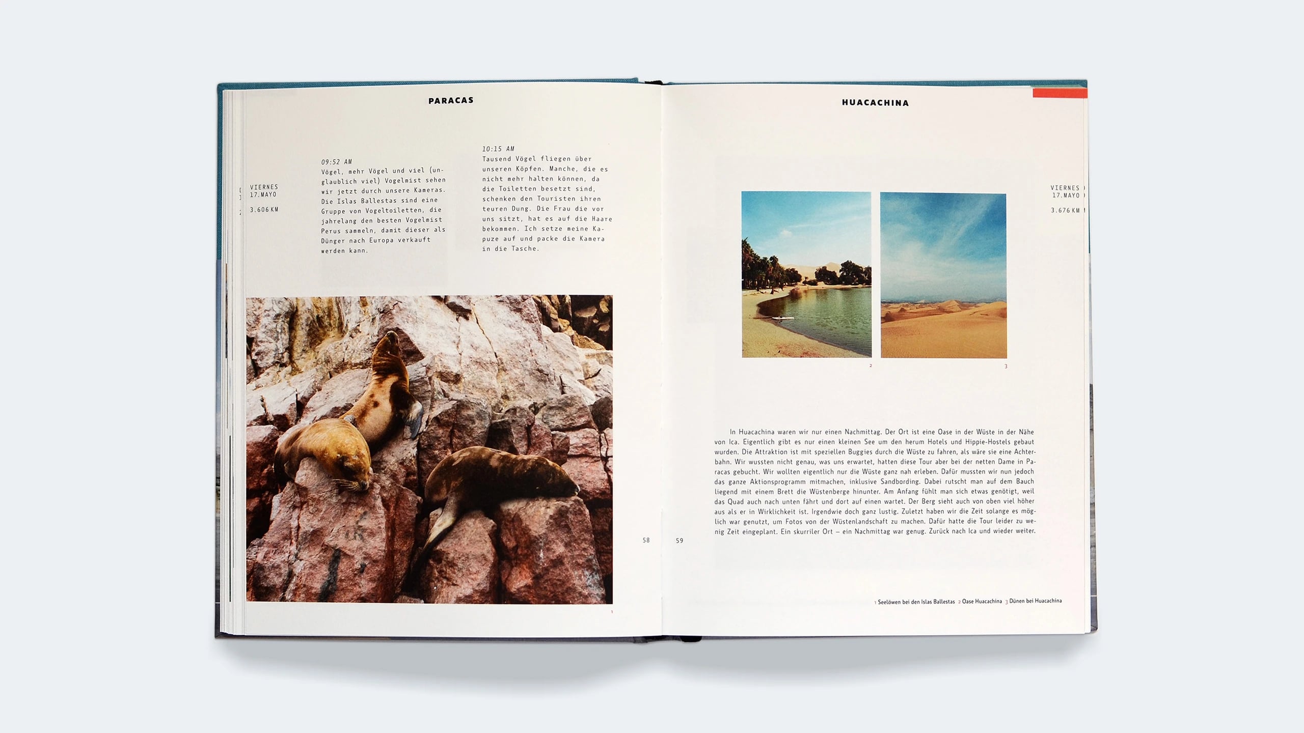
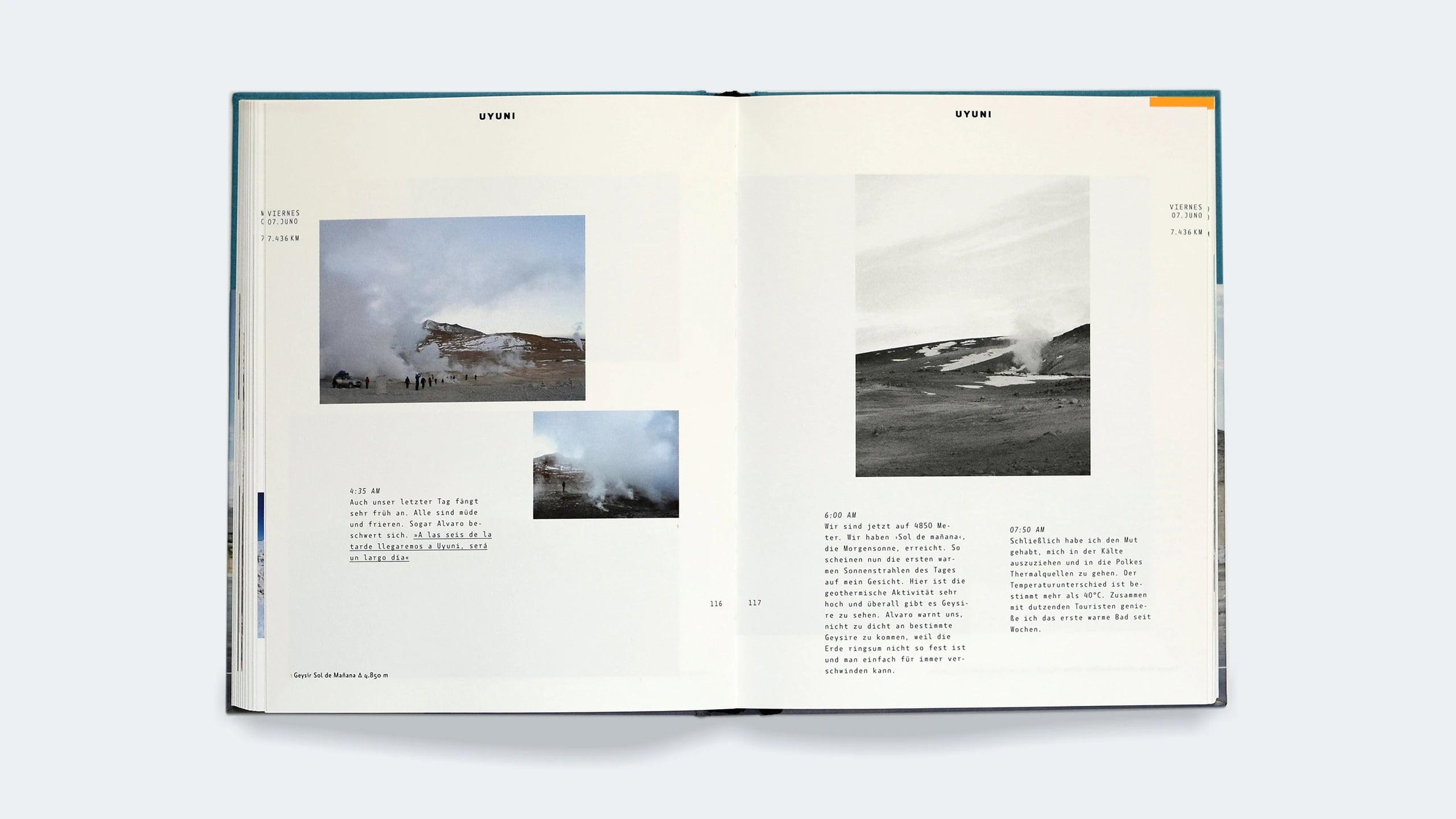
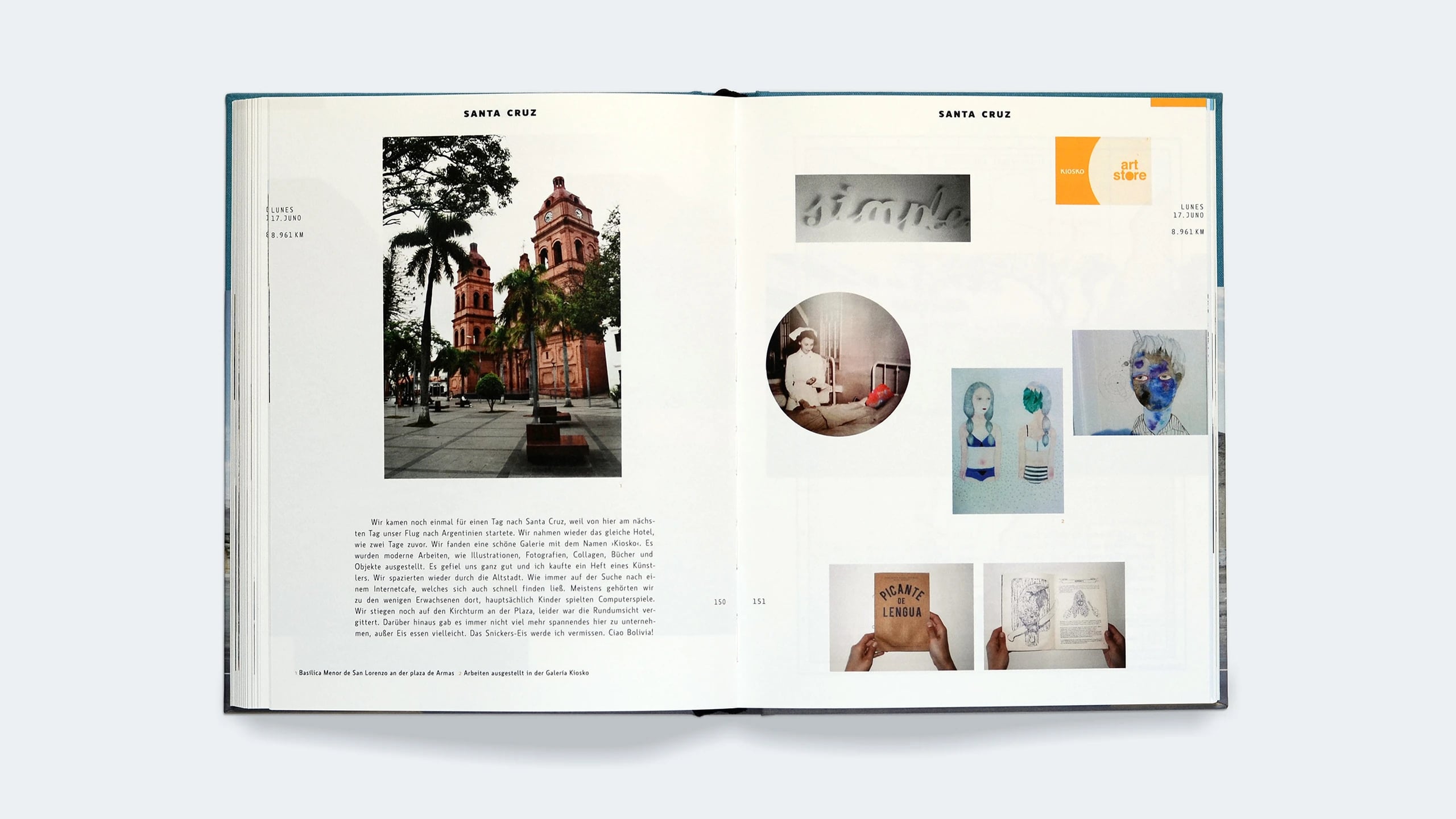
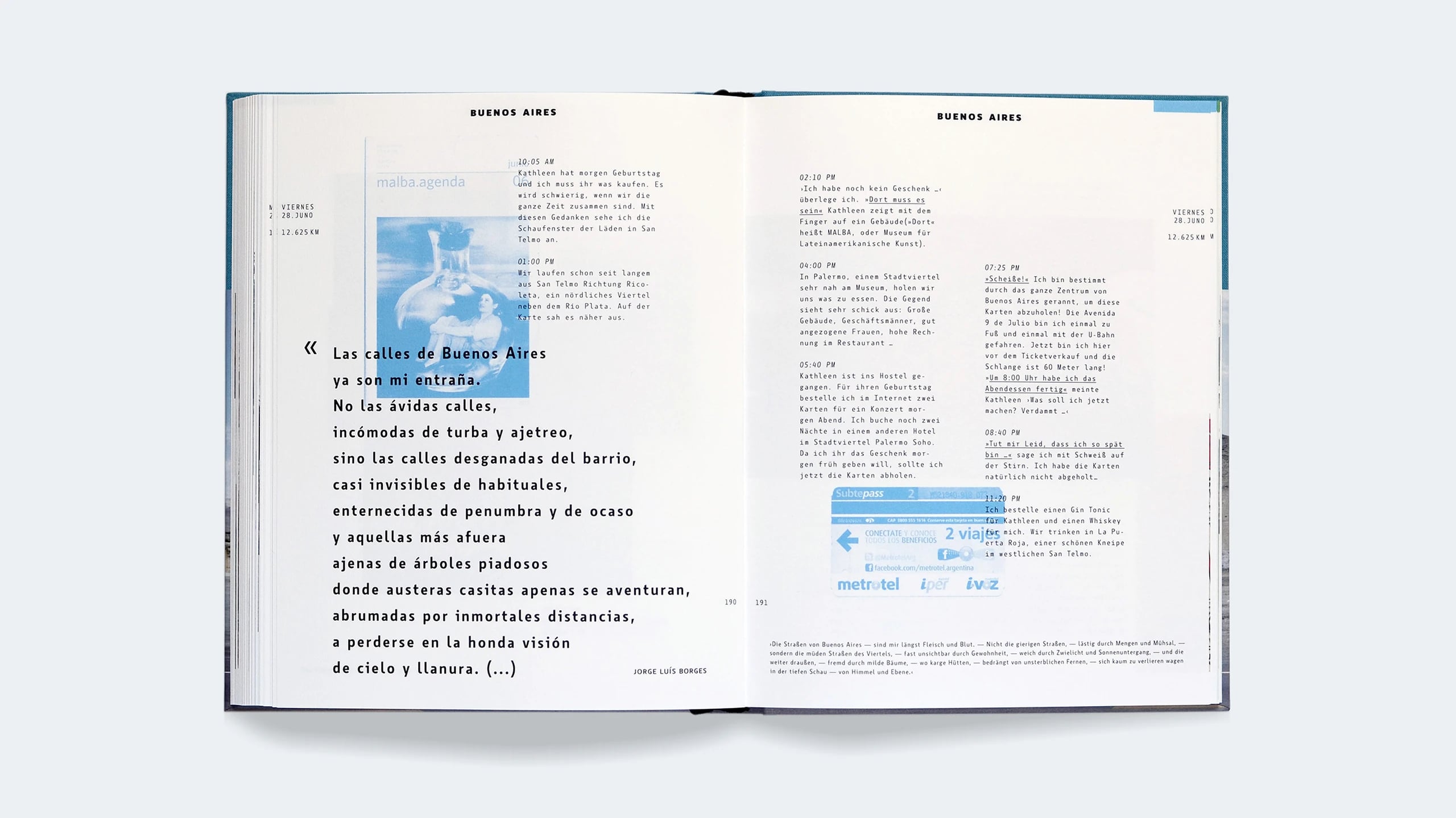
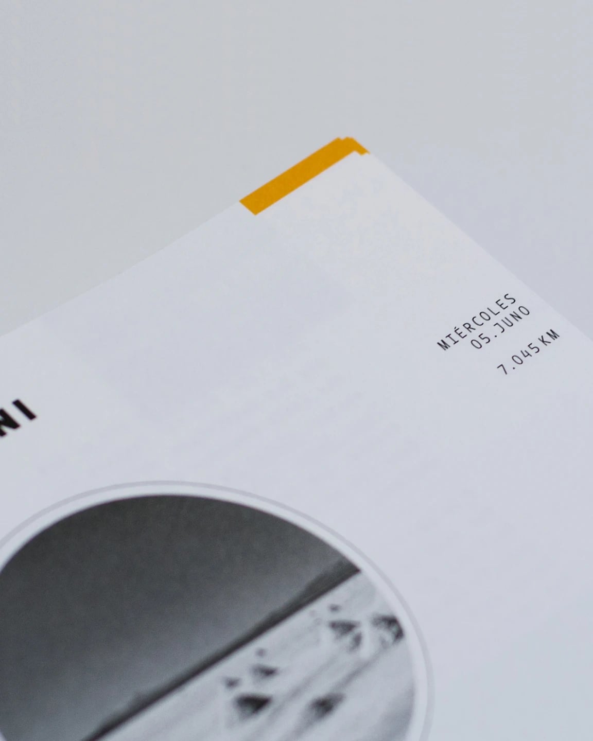
The book was written from two different perspectives: mine and Kathleen Gust’s. My impressions were recorded in the moment, taken directly from the travel journal I carried throughout the trip. Kathleen’s impressions, on the other hand, were the result of end-of-day reflections — a summary of everything she had experienced that day. We used typography to differentiate these two distinct writing styles and convey their rhythm within the layout: time-stamped fragments of text contrasted with solid, justified blocks of words.
02 · Process
Divide and conquer
Kathleen Gust took care of the analog part of the book: layout, typesetting, and film photography. I took care of the digital editing, infographics, illustrations, and the promotional website. Despite the occasional diverging opinions and frustrations, the process was relatively smooth.
03 · Development
From personal impressions to factual infographics
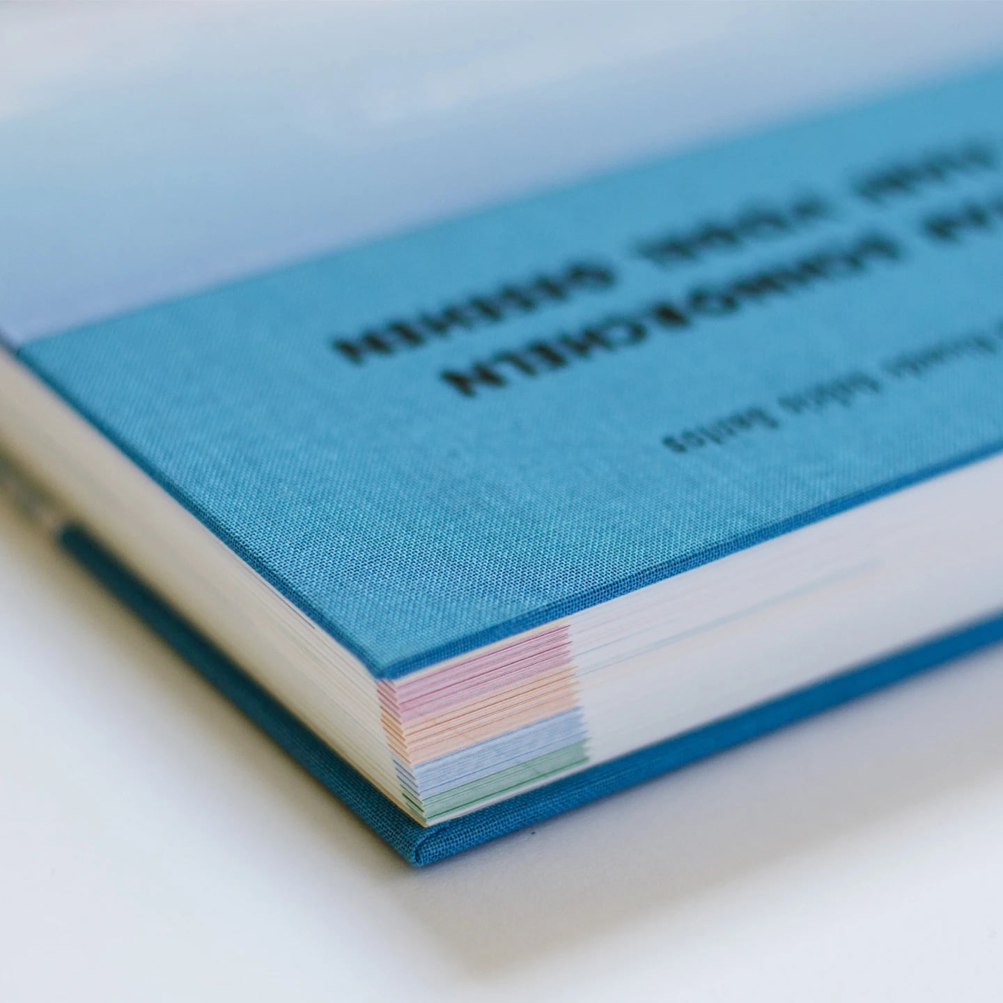
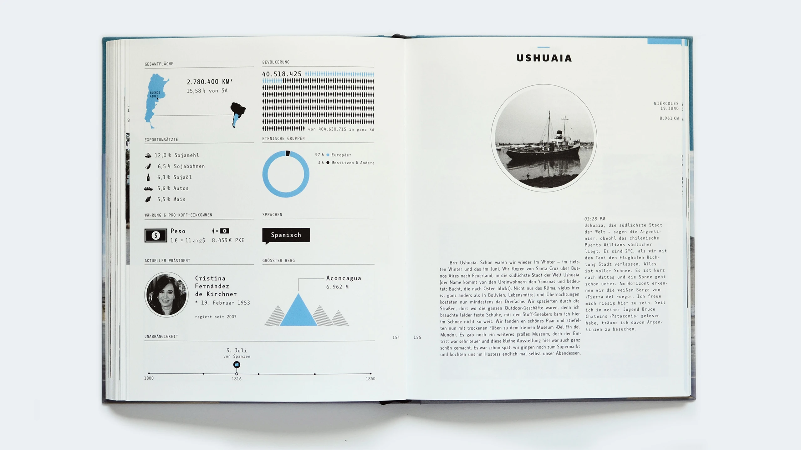
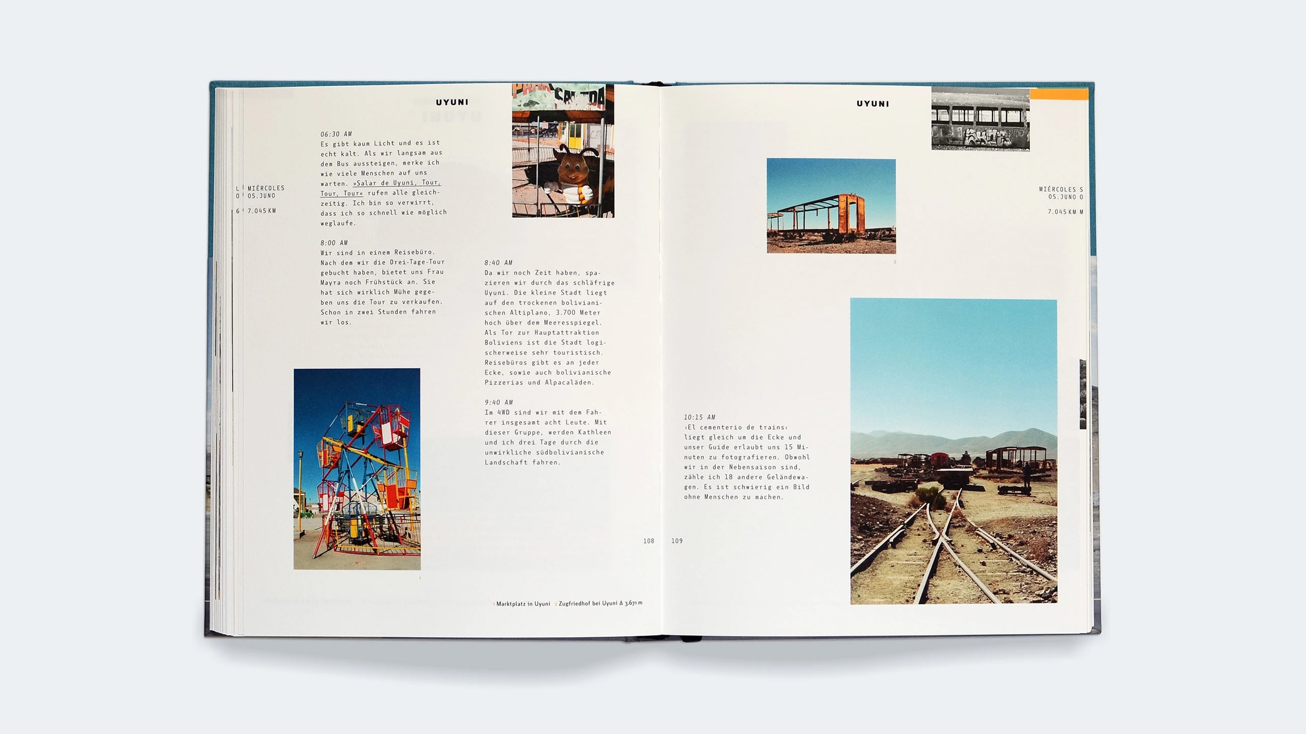
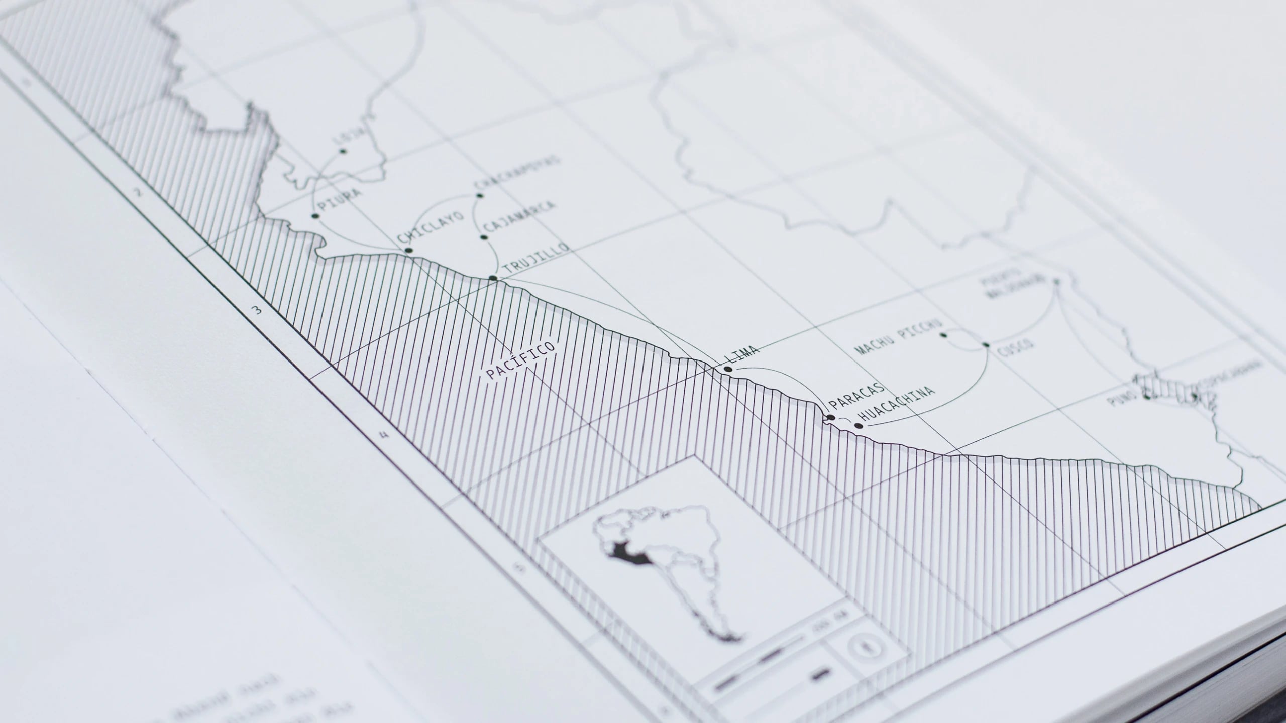
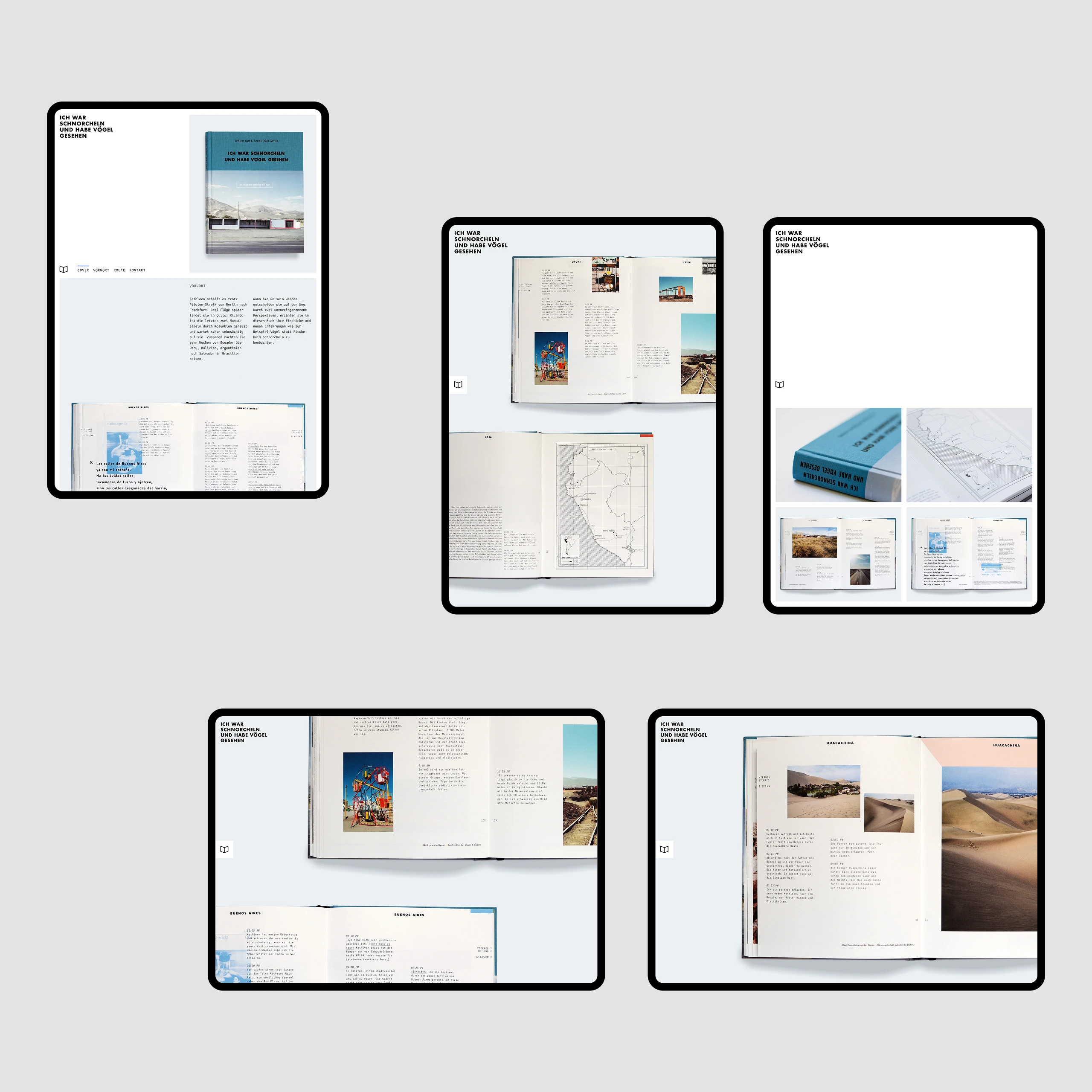
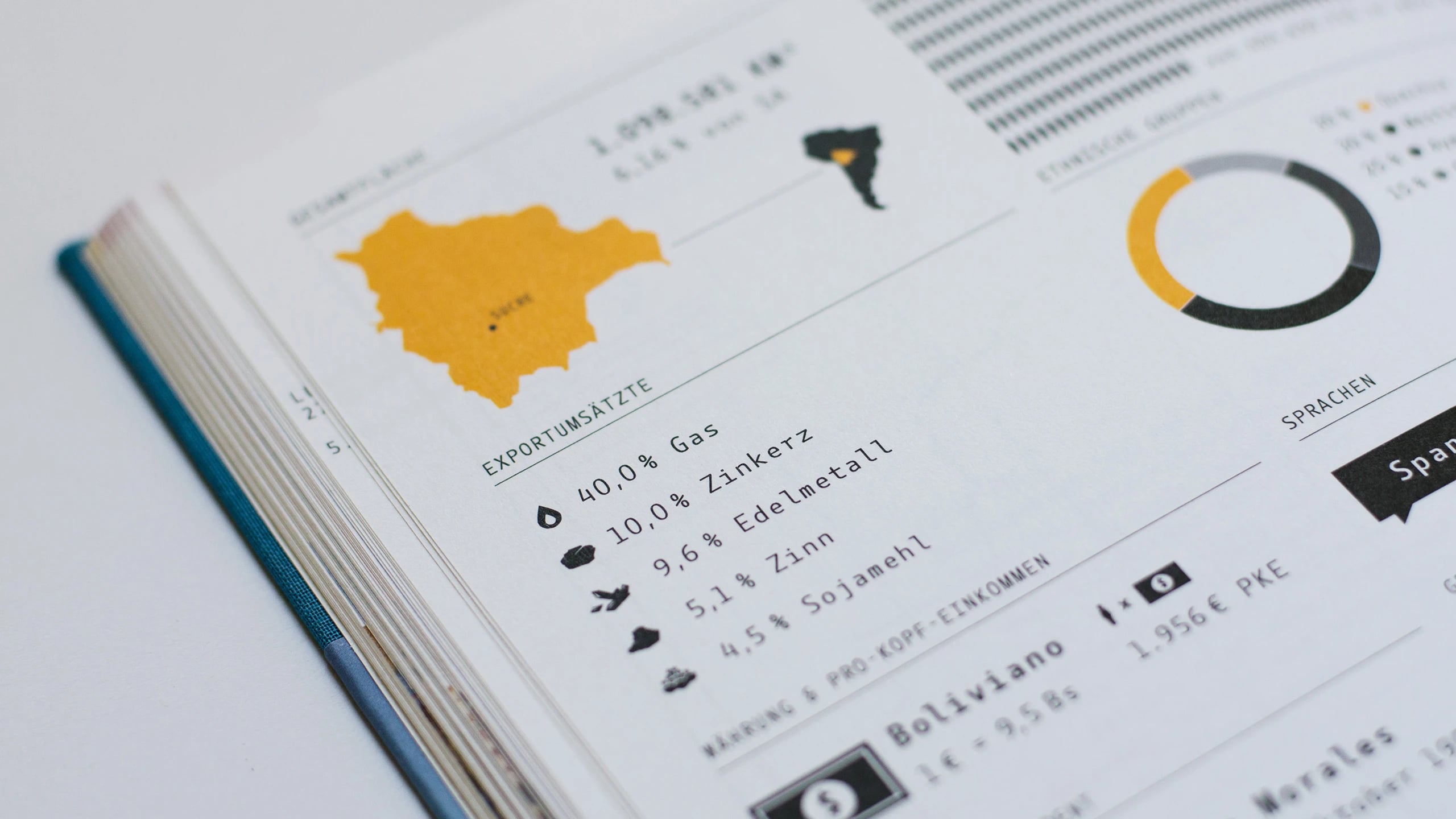
The book follows a linear narrative, with each color-coded chapter representing a country we visited, starting in Ecuador and ending in Brazil. Maps highlighting our stops, paired with factual socio-political infographics, introduce the reader to each new country. The website was created to help find a publisher and features an interactive map as well as images from the printed book.
04 · Outcome
The beauty of print
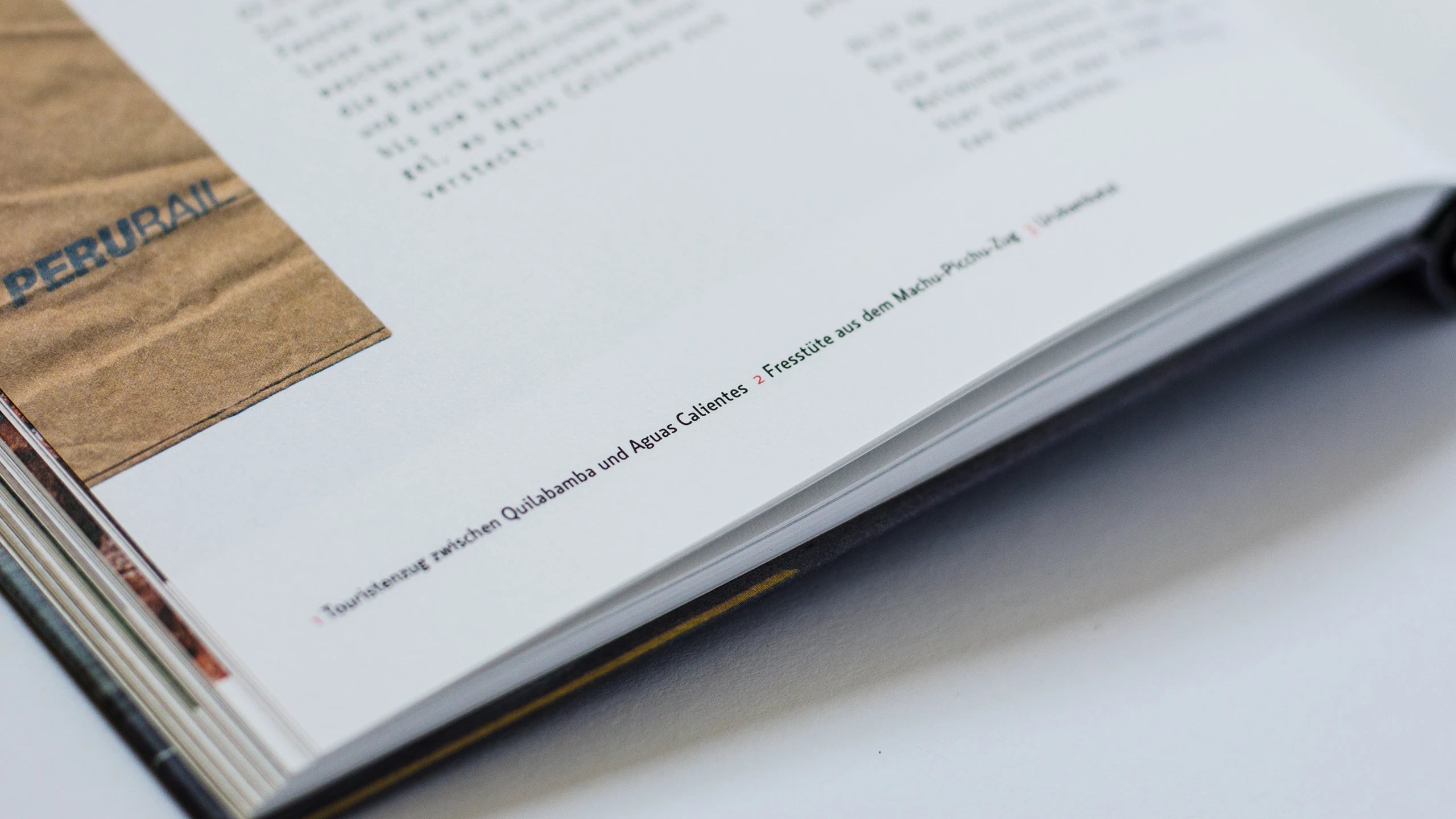
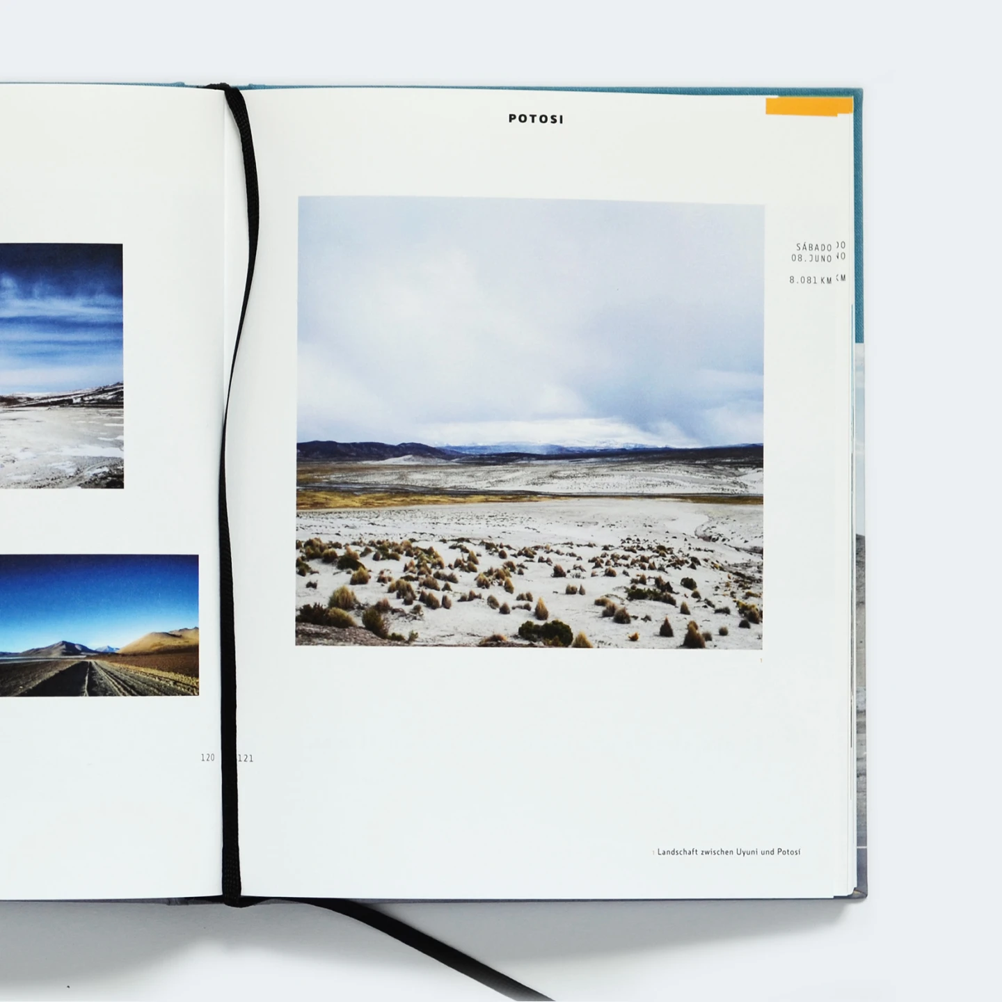
The book features thread stitching and a half-linen binding with letter embossing on the cover. Its 236 inner pages were printed on Metapaper ExtraRough White 120 g paper. The selected typefaces were Botanika Mono and Botanika Standard, both designed by Tomáš Brousil. It was printed with care by Schaare & Schaare GbR in Berlin, and the binding was meticulously executed by Buchbinderei Reinhart & Wasser, also in Berlin.
05 · Feedback
Seeing all these memories on paper makes me feel much less guilty for inadvertently trashing all the postcards you sent me from South America.